

The Bar Chart in R Programming is useful to compare the data. Bar plots can be created using the barplot() function. R can draw Horizontal and vertical bars in the bar chart.
Create Simple Bar Chart
we have a vector of maximum marks of six subjects as follows.
marks <- c(23, 12, 43, 18, 20, 30)we can make bar plot using this data.
barplot(marks)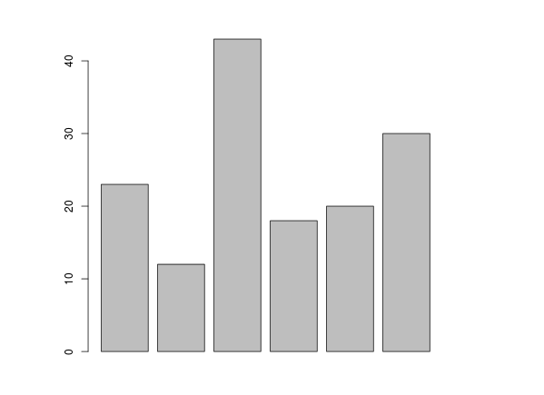
xlab - label for x axis.
ylab - label for y axis.
main - title of the bar chart.
col - give colors to the bars.
names.arg - give name for each bar.
horiz = TRUE- plot bar horizontally.
marks <- c(23, 12, 43, 18, 20, 30)
barplot(marks,
main = "maximum marks in subject",
xlab = "progress",
ylab = "subjects",
names.arg = c("Mar", "Hin", "Phy", "Chem", "Bio", "Math"),
col = "red",
horiz = TRUE).png)